
A warehouse system designed to simplify item approvals, storage, and logistics, supporting a sustainable second-hand marketplace.
Role
Tools
Figma, Figjam, Adobe Illutrator
Involvement
User Research, User Experience Design, Interface design
Context
Relocating is a universal challenge, especially when it comes to handling large items. Without enough time or convenient options to clear out belongings, perfectly usable items often pile up or are discarded. Meanwhile, many people struggle to find affordable and sustainable essentials.
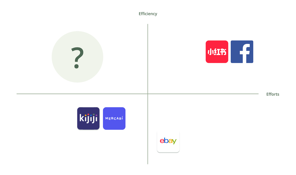
Through market research, I looked into platforms people use to get rid of second-hand items when moving. I mapped them on a scale of efficiency and effort and found a clear gap. Some platforms are efficient but require too much time and effort, like messaging back and forth with buyers who never respond. Others are easy to use but make it hard to predict when, or if, the items will actually be taken. Realizing this, I wanted to build a fast and effortless way for people to clear out space when moving.
Problem Statement
When relocating, people often need to clear out their belongings quickly. However, existing second-hand platforms still require sellers to handle communication, negotiate prices, and wait for buyers, with no guarantee of success. Even if they list items at a low price, there’s no certainty that someone will take them in time. As a result, people are often left stuck with unwanted items.
With this in mind, how can we help people get rid of unwanted items quickly without endless messaging, negotiations, or waiting for buyers?
Research Insights
To gain a better understanding of the factors influencing users' decisions around buying and selling second-hand items, we conducted surveys with over 20 participants, created customer journey maps, and analyzed their interactions with existing second-hand marketplaces.

User Goals

Pain Points

Design Exploration
The Thrifty Warriors Warehouse System simplifies operations by managing product approvals, assigning storage locations, and updating listings for purchase. It streamlines tasks like creating packages, generating tracking details, and processing seller payments. For unsold items, the system offers eco-friendly disposal options, returns, or donations, supporting the platform’s mission of sustainability and efficient inventory management.
Item Listing
Content and Visual Decisions
The item page is designed with clarity and efficiency in mind, organizing data into a clean tabular structure to ensure users can quickly scan, sort, and act on listings. Key elements like status labels and pagination improve usability by helping users prioritize tasks and navigate large datasets. The inclusion of search and filter options supports customization, enabling users to find specific items with ease.
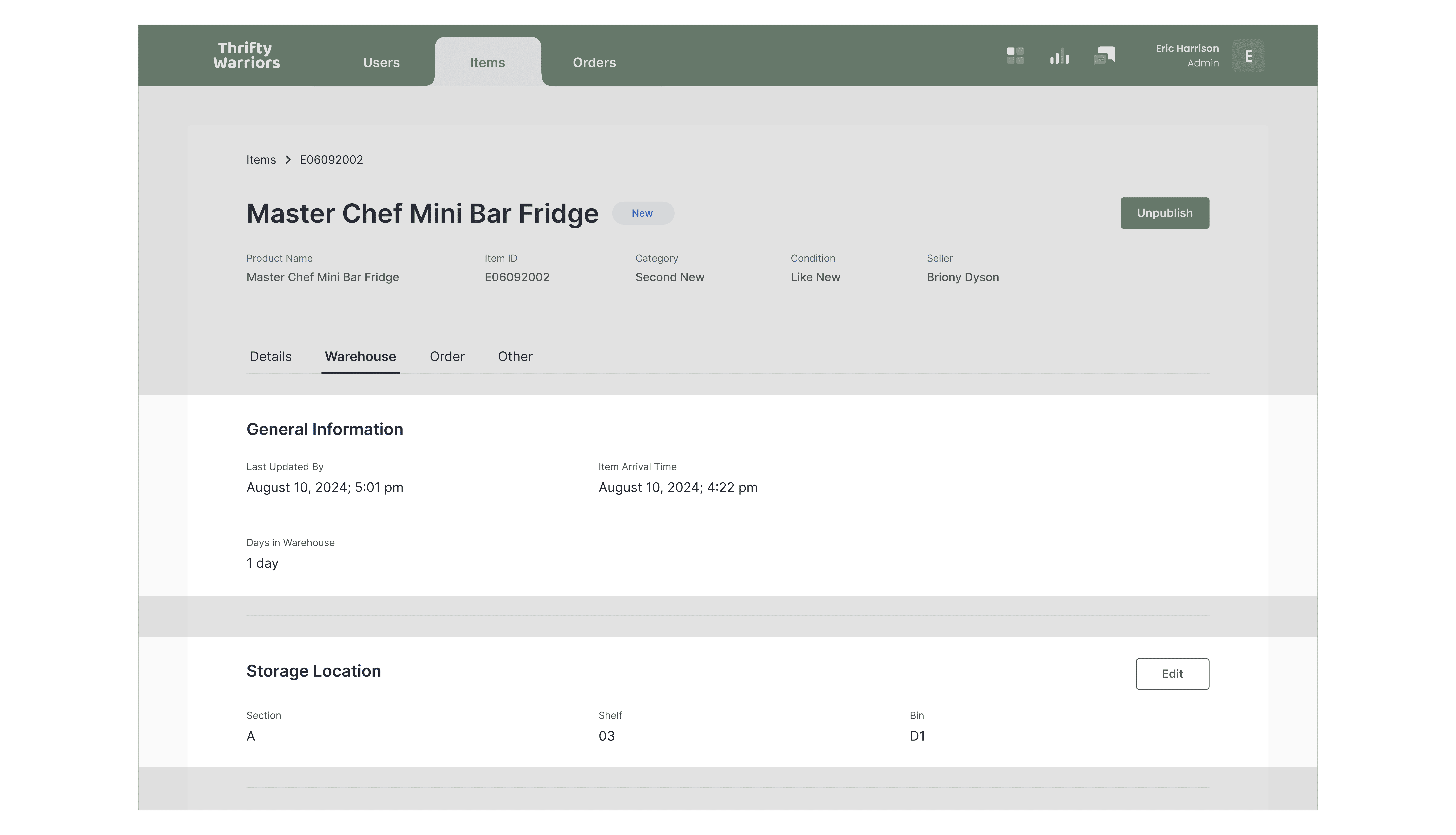
Item Details
Content and Visual Decisions
The Item Details Page provides a structured and intuitive layout for managing and reviewing item-specific information. It ensures a clear separation of key functionalities, allowing users to easily navigate, access, and update essential details.
Header
Information Accessibility
The fixed header ensures core item details, such as product name, category, and seller, are always visible for context. This design decision minimizes user disorientation by keeping essential information accessible, regardless of the section being viewed.

Section Tabs
Content Organization
The section tabs divide information into categories like details, warehouse, and orders, helping users focus on relevant content while reducing cognitive load and avoiding information overload.
Additionally, the tab based structure supports scalability, allowing new features or sections to be added as tabs without disrupting the existing layout, ensuring a flexible and user-friendly design as the platform evolves.

Sections-Based Layout
Chunking (Cognitive Load Reduction)
The section-based layout organizes the interface into distinct areas, allowing users to edit sections as a whole rather than individual fields. This design enhances clarity, making the interface more structured and easier to navigate. Edits are made through a side panel that opens in place, eliminating unnecessary page redirects and maintaining a smooth workflow.
Contextual Side Panel
Progressive Disclosure
The contextual side panel allows users to handle tasks directly within the same interface. Clicking an action button, such as "Edit" or "Pay Seller," opens a side panel tailored to that specific task, minimizing disruptions and keeping the workflow focused.

Action Button
Visual Hierarchy
The action buttons are designed to separate key actions clearly. The top-right corner highlights the main action, like 'Unpublish,' making it easily noticeable. Inline 'Edit' buttons are placed next to specific sections, allowing users to update information directly without switching screens. This setup keeps the interface clean and helps users complete tasks quickly and efficiently.

Order Listing
Content and Visual Decisions
The Order Listing Page makes it easy to manage and track orders. A simple table layout lets users quickly see key details like order status, date, and price. Features like search and filters help users find what they need without hassle, while status labels make it clear what needs attention. The page is designed to save time and make handling orders straightforward and stress-free.
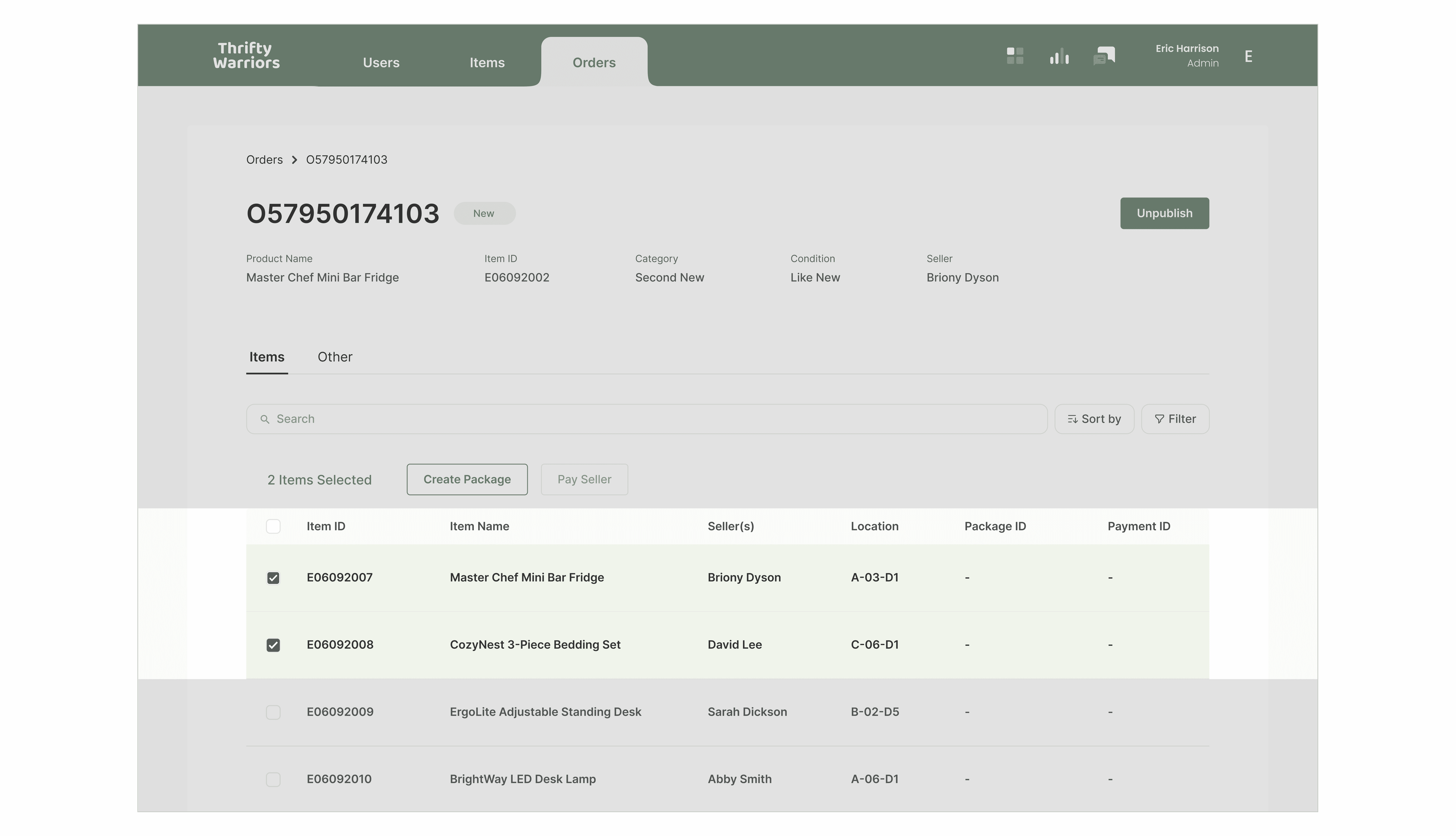
Order Details
Content and Visual Decisions
The Order Details Page offers a clear and structured way to manage and review specific orders. It organizes information like item ID, seller, location, and status into a user-friendly table, making it easy to scan and act on relevant details. Actionable buttons like "Create Package" and "Pay Seller" are strategically positioned for streamlined workflows, reducing the need for navigation and saving time. The clean layout ensures that all necessary details are accessible at a glance, reducing complexity and improving usability.
Action Bar
Direct Manipulation
The action bar is just placed above the item list, clearly displaying the number of selected items alongside the available actions. This design ensures users have immediate feedback on their selections and see the actions they can perform in direct context, reducing confusion and improving task efficiency.
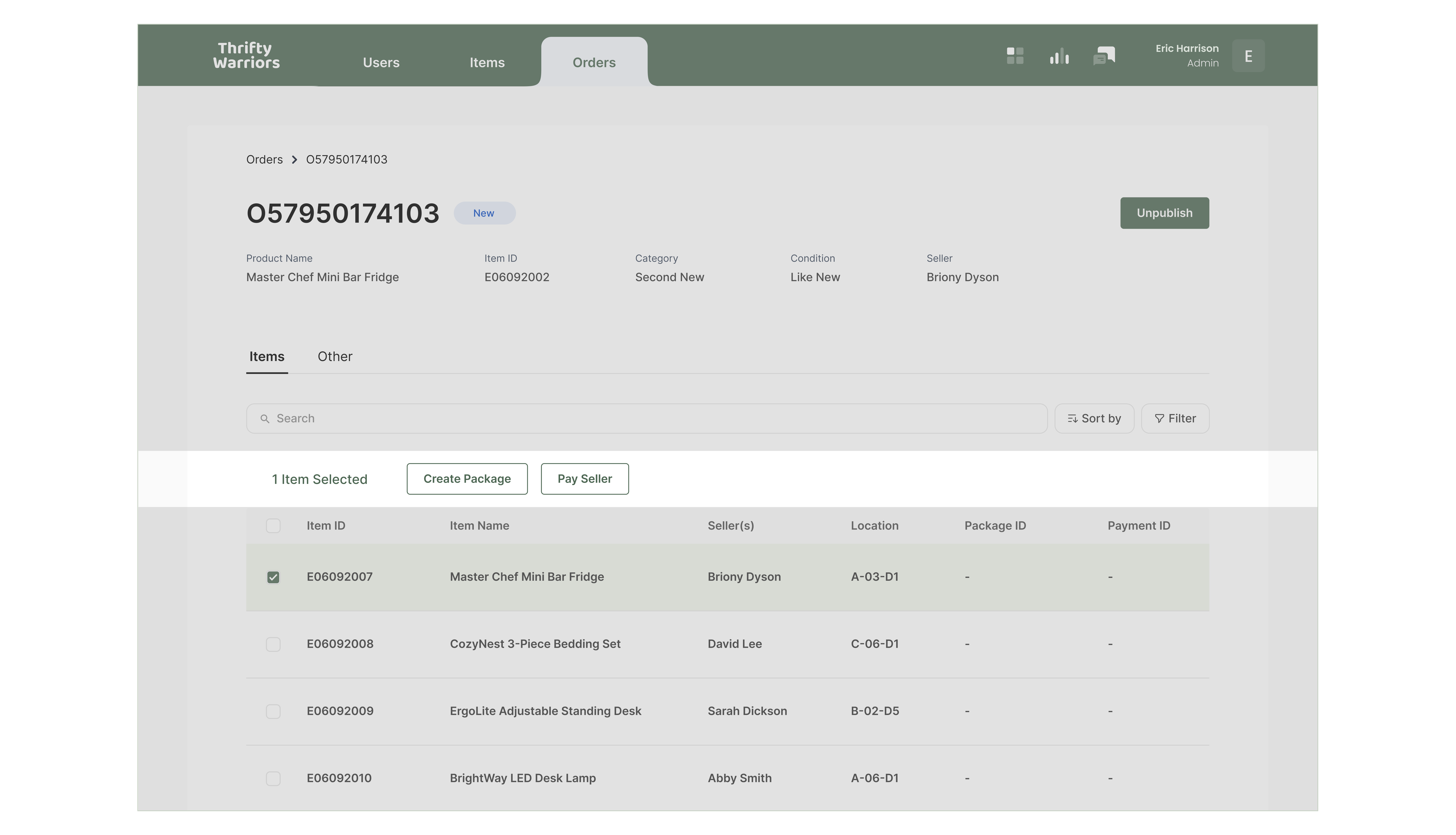
Batch Processing
Error Prevention
For batch processing, the system supports bulk actions like "Create Package," allowing multiple items to be grouped for processing at once. However, "Pay Seller" is restricted to individual items to ensure accuracy and avoid potential errors during payouts. This thoughtful balance provides both efficiency for repetitive tasks and precision for critical actions.
Final Design
Try the Thrifty Warriors prototype and explore its design and features!
Design System
Usability Testing
Using our final prototype, we invited participants from our initial user research for usability testing. They were guided through tasks focused on the core functionalities of the Thrifty Warriors Warehouse System and encouraged to share their feedback throughout the process.

Takeaways
This was my first experience designing a B2B platform, which was a significant shift from my usual focus on B2C solutions. I typically approach design with a customer mindset, focusing on how individuals interact with products. However, this project required me to think from a business perspective, prioritizing operational efficiency and workflows.
One key difference I noticed is that B2B design emphasizes structure and scalability, ensuring tools like the contextual side panel support fast and accurate decision-making for teams. Rather than focusing solely on user engagement, the goal was to create systems that streamline tasks and integrate seamlessly into complex workflows. This experience taught me to consider the needs of entirely different user groups, such as administrators and staff, and helped me develop a more holistic approach to design.